How to Style Select Field Dropdown in Webflow

Webflow is a powerful tool for designing visually stunning websites, but when it comes to styling form elements like select dropdowns, many users find it challenging. By default, Webflow’s select dropdowns are limited in terms of customization. However, with a few tricks and some CSS, you can easily style them to match your website’s design. In this guide, we’ll walk you through the process of customizing select dropdowns in Webflow to create a seamless and visually appealing user experience.
Why Style Select Dropdowns in Webflow?
Select dropdowns are a common form element used for options like country selection, pricing plans, or categories. While they are functional, their default appearance can feel out of place on a beautifully designed website. Customizing these dropdowns ensures:
- Better User Experience (UX): A styled dropdown feels more intuitive and engaging.
- Brand Consistency: Match the dropdown’s design with your website’s aesthetics.
- Improved Conversions: Well-designed forms can lead to higher user engagement and conversions.
Step 1: Add a Select Field to Your Webflow Form
- Open your Webflow project and navigate to the page where you want to add the form.
- Drag and drop a Form Block onto your page.
- Inside the form, add a Select Field element.
- Populate the dropdown with your desired options (e.g., countries, categories, etc.).
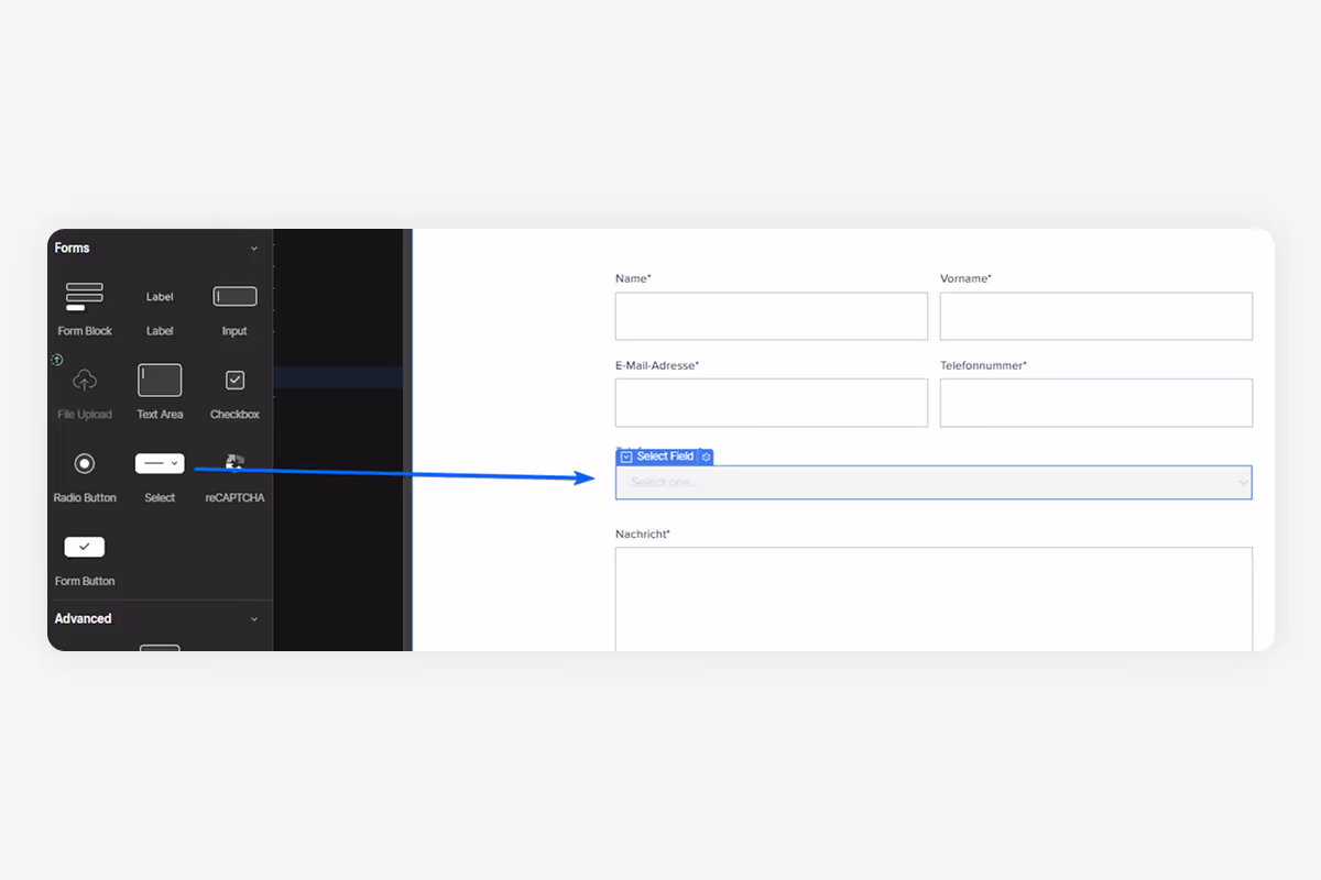
At this point, the dropdown will have the default Webflow styling, which is functional but not customizable within the designer.
Step 2: Add a Custom Class to the Select Field
To style the select field, you’ll need to add a custom class:
- Select the Select Field element in the Webflow Designer.
- Go to the Settings Panel on the right and click on the Style panel.
- Add a custom class name, such as
.form_select
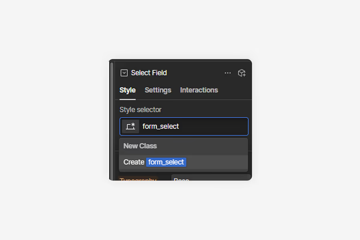
This class will allow you to target the select field with custom CSS.
Step 3: Remove Default Styling with Custom CSS
Webflow’s native designer doesn’t allow full customization of select dropdowns, so we’ll use custom CSS to remove the default styling:
- Go to Add Elements (or press A for the shortcut) and add a Code Embed element anywhere on the page.
- Use the following CSS to remove the default dropdown arrow:
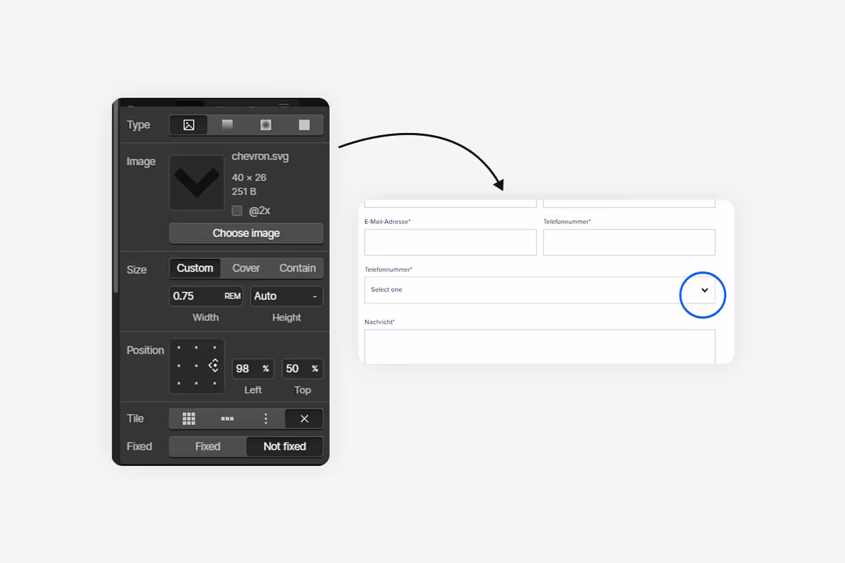
Step 4: Customize the Dropdown with Webflow’s Style Panel
Now that the default styling is removed, you can fully customize the select field using Webflow’s Style Panel:
- Select the
.form_selectelement and open the Style Panel on the right. - Scroll down to Backgrounds and click the + icon next to Image & Gradient.
- Upload a custom arrow image (or use an SVG for scalability).
- Adjust padding, borders, colors, and other properties to match your design.
Step 5: Test and Publish
- Preview your design to ensure the select dropdown looks and functions as expected.
- If everything looks good, publish your site to make the changes live.
Conclusion
Styling select dropdowns in Webflow may require a bit of custom CSS, but the results are worth it. By following this guide, you can create visually appealing and user-friendly dropdowns that enhance your website’s design and functionality. Whether you’re building a contact form, a pricing calculator, or an e-commerce filter, custom dropdowns can elevate your Webflow project to the next level.
Table of contents

